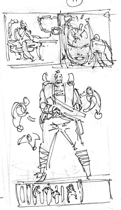
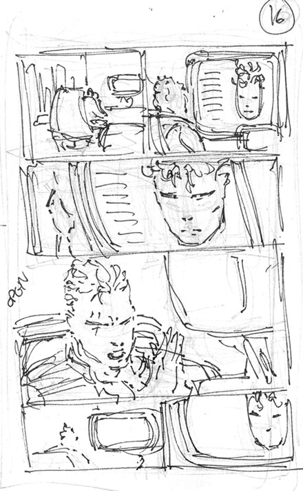
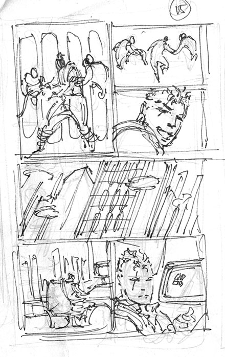
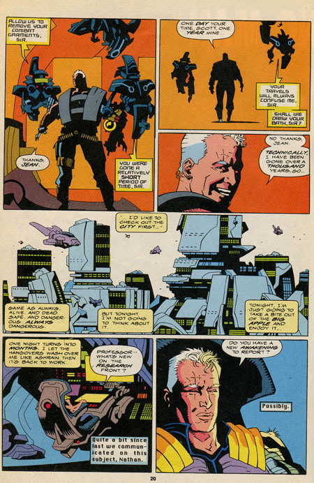
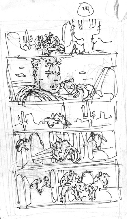
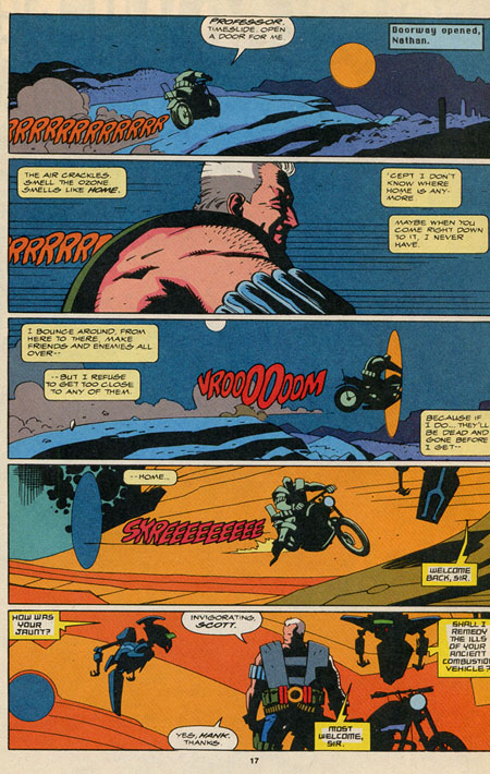
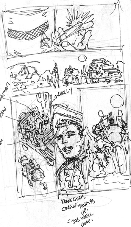
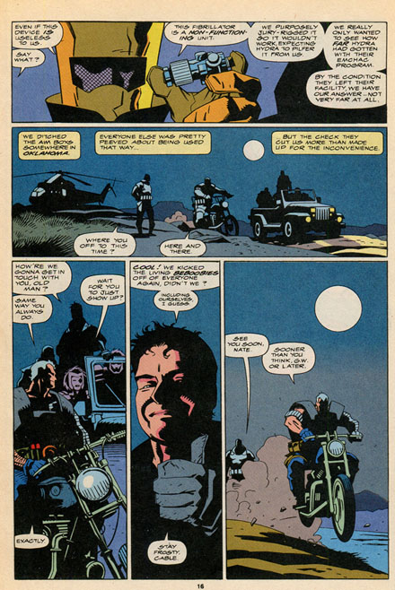
Rob Liefield නම් චිත්ර ශිල්පියාගේ
Layout design වලට
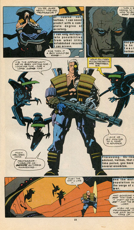
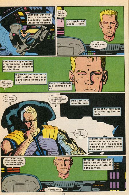
Mike Mignola නම් චිත්ර ශිල්පියා ඇන්ද
චිත්රකතා පිටු කිහිපයක්.
චිත්ර කතා අඳින අයට
හොඳ අත්දැකීමක්...
Download කරගෙන සසඳා බලන්න.
Mike Mignola and Me
I
had the great pleasure of working with Mike Mignola once in my career.
It was way back in 1991 while I was writing and drawing X-Force and the
schedule was getting heavy and after the initial 7 issues I needed a
break. X-Men editor Bob Harras had some potential fill-in artists in
mind, one of which was Mike Mignola whose work I loved. Bob wanted me to
stay on as layout artist for the issue as well as provide a framing
sequence to keep the flow of the book. DC Comics had been practicing
this for some time, utilizing Kieth Giffen as a layout artist on Legion
issues he couldn’t fit into his schedule, helping to unify the look of
the book.
The phone rang a few days later and the gentleman on the other end
said ” Hi! It’s Mike Mignola. I think your layouts are fun. I’m looking
forward to working from them.” I told him I’d tailor the book to his
strengths and that was it, we were off to the races. I lost these
layouts for awhile and as a result I wasn’t able to use them in the
recent X-Force collections from Marvel. I thought I’d share them here on
my website. You can see where he changed the gestures and cropped some
shots while staying faithful to the composition. I learned a great deal
from how he handled my layouts, especially the way he lays down shadows
and spots blacks. Great memories. Funny note, afterwards Mike told me he
never, ever draws downshots, or anything from a bird’s eye view. You’ll
see that he adjusts anytime I call for a downshot. Having followed his
work for years, I can confirm that he rarely, ever, ever veers from that
commitment. Enjoy!

No comments:
Post a Comment